
Contributor
- Topics: Archive
Last September I was staying at Kalaloch Lodge on the Washington coast as the first rains of the season settled over the gray-shingled cabins. The sky was gray; the Pacific’s eternally moving waters were gray as they ruffled up the gray sand beaches. There were probably southward-bound gray whales out of sight under its surface. Even the saturated lawns, the willows, and wind-dwarfed conifers, though green, felt numbingly gray. It was early. I was walking the dog, pre-caffeinated, and so was wedded with this gray morning in many ways.
As our rather gray dog finished her business, a woman came out of the neighboring cabin. Her tall thin stature was accentuated by the floor length white nightgown she wore, her shoulders covered with a red cardigan, she stood under a red umbrella. She lit her first cigarette of the day looking like a Valentine’s Day ad for Virginia Slims.
I couldn’t help but stare. Not at her so much as at the color she brought to this dreary scene. The color wakened me. From under her red umbrella, puffs of smoke emerged and joined the morning fog. Almost as if from under the red umbrella, this smoking woman was the preternatural source of all this gray. The Sufi mystic Serif Catalkaya calls red the first color, the source of all color, the spark that ignites life. It is the color of bloody birth and the ripeness of fruits offering their seeds to the world. It is the seduction of one fruit that got us expelled from that ready-made garden so long ago. Red starts things up.
Red is sexy.
It is a bordello. It is the single long-stemmed rose that says, “I love you.” And red is fickle, bedding both the Communists and the Republicans with ease.
Red is also my favorite color.
It is the favorite color of many of you—at least until you were eight. A high percentage of children under eight consider red their favorite color; after that cool colors take over, blue finally winning as most favorite, at least in the West. This is why I chose to start this series of six articles on color—the three primary (red, yellow, and blue) and three secondary (purple, orange, and green)—with red.
Red says, “Stop!”
Many garden designers caution against using red. English garden designer and writer Mary Keen warns, “Red… like all stimulants, needs to be handled carefully and treated with respect.” Even the adventurous gardener Christopher Lloyd complains “Large blocks of undiluted red are a mistake; as indigestible as swallowing a lump of uncooked dough.” Floral designer Malcolm Hillier calls red “A blunt jab in the ribs.”
With attitudes like this from garden color experts, it is no wonder that temperate gardeners shy from red. Though the hue is frequently chosen for flags of northern nations, it is more commonly found in tropical gardens; consider the hibiscus of the Caribbean or the poinsettia trees on the Hawaiian Islands. Certainly in Northwest gardens we have our share of monstrous red rhododendrons, but aren’t you happy when they finally stop blooming and ruining the subtle soft shades of spring you so deliberately planted?
Red agitates.
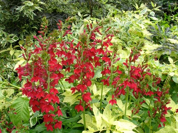
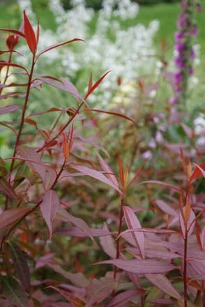
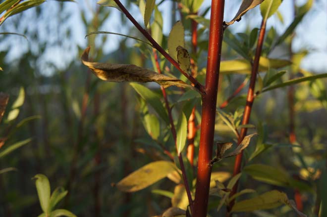
Yet, I would say the problem with red in the garden isn’t red but green. Greens dominate gardens and green is red’s opposite, or complement. As red’s complementary color, green makes red angry—makes it “redder” if you will, isolated. Red needs to be invited in, coaxed into harmonious relationship with the rest of the garden. Pure red is rare in plants, and that works to our advantage as gardeners. More often, one finds cool red tinged with blue: cerise, crimson, and maroon. Or warm red livened with yellow: scarlet, cinnabar, and vermillion. These two directions of red are the key to its use, and they should never be mixed.
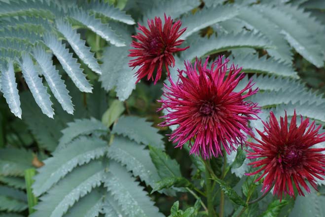
Cool red blends nicely with bluish-green and gray foliage, and pairs with purple, and even blue flowers with very little dissonance—but can bristle in the presence of yellow. Yellow, both in foliage and flowers, harmonizes with warm red, which contains a bit of that hue. Warm red truly sings with bronze, mahogany, and plum foliage, which acts as their liaison with the greens of the rest of the garden.
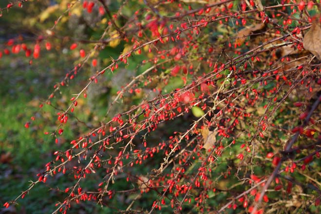
Red advances in the garden, makes distances seem shorter. Still garden colorists Nori and Sandra Pope recommend “intimate viewing for the most emotive color—because on the whole it absorbs light, and reflects very little.” The doyenne of the gardening world, Penelope Hobhouse, echoes their sentiment calling red “deep and mysterious up close.” Though I advise against using red in a small or enclosed setting, where it will cripple like an ill-fitting shoe, I agree on the need to see red up close. Red draws you in. It is nature’s intent with red to focus the eye. Think of the seduction of fruits: raspberries, cherries, and apples. Or, if you are a hummingbird, the flirtations of flowers: roses, fuchsias, and salvias.
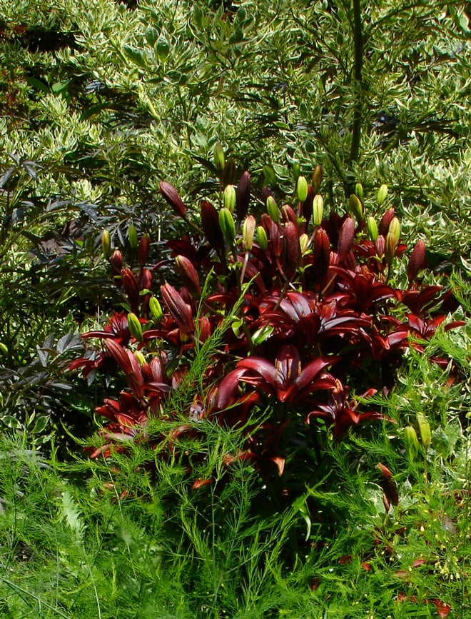
This deep and mysterious pull of red makes its placement in the garden crucial. Red is hungry not only for attention but for light. In shade it looks flattened and dark. And though it becomes luminous in the fading light of day, it quickly turns black when the sun sets, a good thing to keep in mind if you entertain in your garden at night.
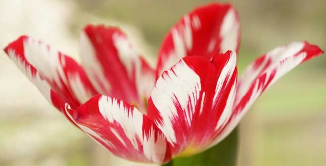
Of all the allies red has in dark foliage, or in companionable orange and regal purple, I find none more delightful than white. White is the only color that can hold its own against red’s intensity. Its purity soothes red, calms its nerves. Cheers it up. Red and white are the colors of the Danish flag, which flies over some of the happiest people on earth. The Chinese, whose love affair with red is legendary, pair red with white to symbolize the ultimate happiness. The combination is two thirds of the rather trite bedding trident of red, white and blue—a duo as childish as candy canes and Santa Claus, circus tents and valentines. But they are also the blood and bandages of the barber’s pole and our nation’s flag. And, yes, stop signs. Yet I cannot stop my delight in white tulips streaked with red, or those crazy petunias, red and white like peppermints.
Red was one of the first colors used by man in the Neolithic cave painting at Altamira and Lascaux. Were these first colorists dreaming of a bloody rare steak as they painted their emblematic beasts? Or did they use red because red ochre was easily obtained, the technology for blue and green pigments millennia beyond them? My own penchant for red has mellowed over the years; I prefer sophisticated reds—burgundy, plum, and maroon—to fire engine and firecracker reds. Maybe I am finally maturing as a garden designer and colorist.
Or maybe not.
When that smoking red umbrella transfixed my feeble morning attentions last September, pulling me out of a dreamy fog and back into life, I realized that I still love excitable, blunt, childish red.
And maybe that’s okay.
Share:
Social Media
Garden Futurist Podcast
Most Popular
Videos
Topics
Related Posts
Low Maintenance Gardens – Better for Pollinators and People
Autumn 2022 “I come out every day. It’s therapy, my meditation.” Janet’s young garden transformed from overgrown, invasive plants to mostly natives. The dailiness of
Invasive Plants Are Still Being Sold: Preventing Noxious Weeds in Your Landscape
Autumn 2022 With so many beautiful ornamental plant species and cultivars throughout California and the Pacific Northwest, how do you decide which ones to include

Garden Design in Steppe with Transforming Landscapes with Garden Futurist Emmanuel Didier
Summer 2022 Listen to full Garden Futurist: Episode XVII podcast here. Emmanuel Didier, Principal and Creative Director at Didier Design Studio is a leading figure
Seslerias: Versatile Groundcover Meadow Grasses
Summer 2022 Without question, the most beautiful and versatile of all the groundcover meadow grasses are the moor grasses (Sesleria). Moor grasses tick off all





Responses